
What happens in your brain when you read a map or untangle the meaning of a new word? A complex and rapid process of interpreting environmental stimuli, signals, and context clues from the world around you.
Let’s talk more about how we understand the meaning of new words. You are a few paragraphs into an article and BAM, a word you’ve rarely encountered pops up mid-sentence. As a curious reader, you avoid the temptation to skip this new word and instead decide to find out its meaning.
When we look up the meaning of a word in a dictionary, our brain follows a certain process. First, it performs a quick scan of the newly encountered word to see if it seems genuine. If the word has too many vowels or too many consonants in a row, for instance, a word like “qxpyti” or “uoeira”, then your brain quickly flags it as a nonsensical word. If it seems genuine, we next take the word and look it up alphabetically in the dictionary. If we find the word in the dictionary, we take its meaning, plug it into the context where we found the word and see if it makes sense. If the meaning doesn’t make sense, or we don’t find the word in the dictionary, we know something is wrong and begin to check the word itself.
This process of understanding and contextualizing a new word is connected to the human brain’s capacity to perceive and interpret multiple signals from the external environment — aka stimuli — in real time. This ability to understand multiple signals simultaneously means the human brain can process information extremely quickly, in some cases, even faster than a computer. In his paper “Some Implications of Comparing Brain and Computer Processing”, Brian Whitworth writes that “While supercomputers have limited parallel processing, millions of human retina cells parallel process boundary contrast information before the signals leave the eye. Parallel processing explains how the brain recognizes sentences or faces in 1/10th second, faster than most computers.”
Decoding how our brain processes and perceives the world can help us design more intuitive data visualizations. Let’s break down how the brain’s visual perception process works and see what we find!
The Building Blocks: Five Visual Features To Know
Every object looks different and uniquely recognizable because of visual characteristics such as size and color. There are five important visual features you should pay special attention to when creating your data visualization. (Out of these five, some visual features are processed by the brain faster than others such as spatial positioning or distance.)
When creating data visualizations, it is your job to account for the visual features that helps your data speak to the reader. The five visual features you should pay attention to are position, color, size, shape, and orientation.
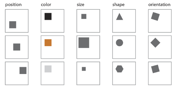
Below are examples of the five primary visual features.
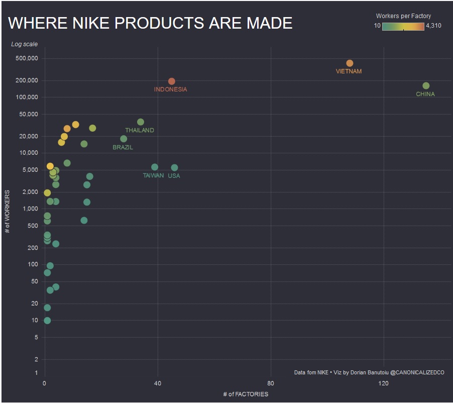
1. Position: In this scatter plot, the creator uses a mix of color and position to help us understand in which countries Nike produces a majority of its products. The outlier countries (China and Vietnam) are easier to read than the more clustered countries. In addition, the color of each dot gives us additional information about the number of workers employed in the Nike factories in any given country.
2. Color: Choosing contrasting colors helps improve the readability of your visualization. In this marker map of India, we helped Oxfam visualize the implementation of India’s Right to Education Act (RTE), a 2009 act that sets basic standards for what every child in India should have access to while at school (such as an adequate student-teacher ratio or in-school toilets).
In this map, colors (on a scale of 1-10, with 1 being the lowest score possible and 10 being the highest) show the average district-level score for how well RTE was implemented. Dark green districts had a score of at least 9 on a scale of 10. Districts in red had an average implementation score below 5 on a scale of 10.
When working with color, bonus points for choosing colors that are associated with specific emotions or responses — for example, red as danger or green as success. However, it’s important to check your color choices against your audience’s norms. Each culture and region has different associations with different colors. For more on color and culture, check out this infograph on what different colors mean around the world.
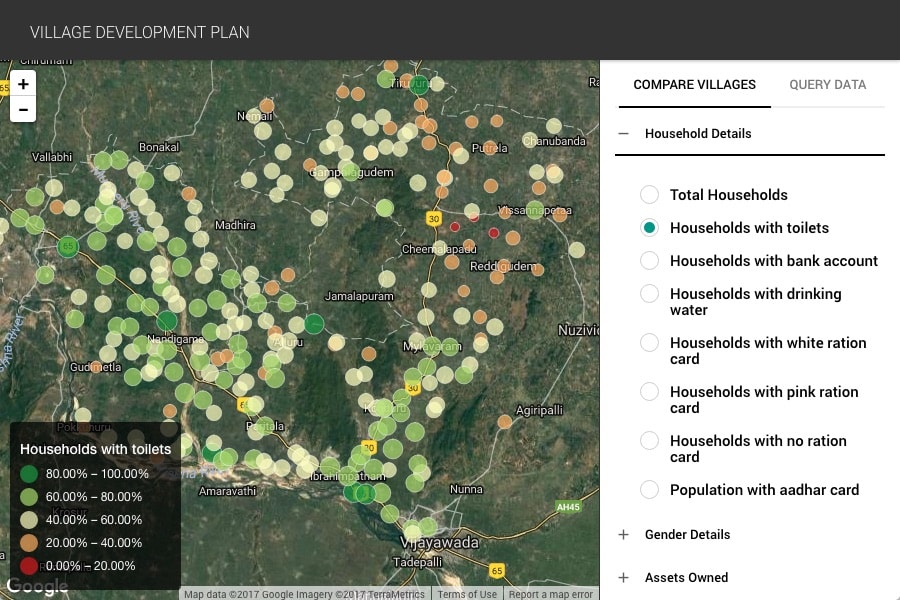
3. Size: The size of the markers used can help us understand and read data. In this map of a Village Development Plan for Vijayawada (a city in the state of Andhra Pradesh, India), the size of the dots is correlated with the percent of households that have a toilet. This map also uses contrasting colors to differentiate between the percent ranges.
4. Shape: Here, the graph maker is using two different shapes (an office building and a home) to show the percentage of full- time office workers that do at least some work at home (~27%). The symbols are easily distinguishable. The use of highly contrasting colors also make the graph easier to read.

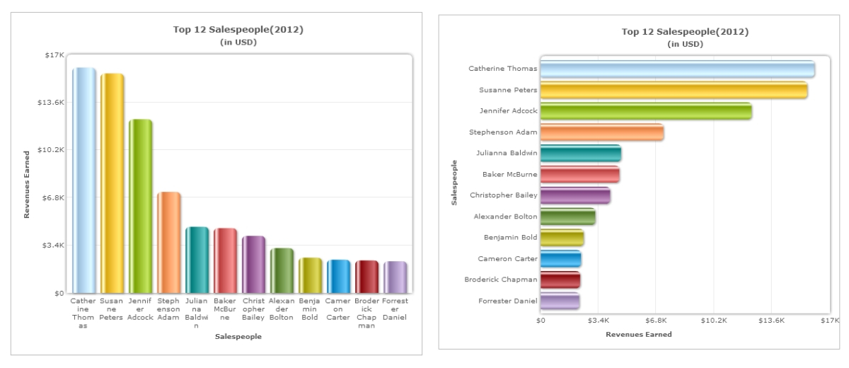
5. Orientation: The orientation of your visualization can significantly impact readability. Take for example bar charts vs. column charts. Whether you use columns or bars impacts how people read and compare the information. In this example, the information being compared is the same, but switching from a column chart to a bar chart makes the graph labels easier to read.
The Human Visual Perceptual Process
The human visual perceptual process — the way the human brain perceives visual information — consists of two subsystems:
- Low-level vision (pre-attentive processing): This is responsible for extracting physical properties of the visible environment such as depth, three-dimensional shape, object boundaries, surface material properties, color, and shape.
- High-level vision (focused attention): This is responsible for object recognition and classification. This is where our brain examines the memory for similar-looking objects and then identifies what the object actually is.
This process is called “The Feature Integration Theory”, and it is one of the most widely accepted and influential psychological models on how the brain processes what the eye sees. Developed by Anne Treisman and Garry Gelade in 1980, the theory explains that, in the visual perceptual process, first the low-level vision begins the visualization process by broadly reading physical properties such as color and shape and then, 200 milliseconds later, the high-level vision joins in to help us recognize and classify the object based on what we’ve seen and known before.
Stage 1: Pre-Attentive Processing
Pre-attentive processing is a term that refers to the subconscious accumulation of information from the environment. In pre-attentive processing, the brain does a “feature search” to identify key features — size, shape, color, orientation, movement — of the visual. This uses the low-level vision.
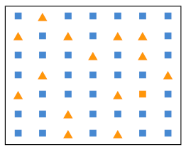
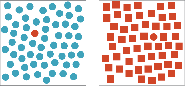
The brain absorbs all available information and processes each feature in a different area of the brain. Each feature requires a different amount of time to be processed. For instance, our brain has a harder time telling the difference between shapes than between colors. In this image, the brain quickly identifies the red circle from among the blue circles but has a harder time finding the red circle from among the red squares.
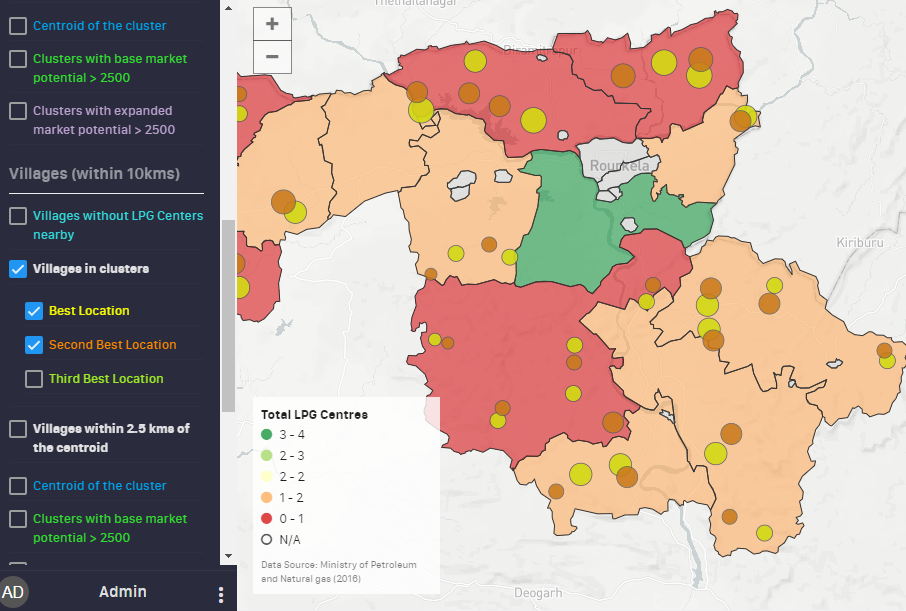
The brain’s ability to easily distinguish between colors helps us understand that using colors can be helpful when we want to highlight important information. For instance, in this marker map visualization of locations for new LPG distribution centers in a district in India, bright yellow and orange circles are used to easily differentiate between the best and second best locations, respectively. In addition, matching the color of the dots to the corresponding text in the legend helps with easy identification.
In our dictionary example from earlier, the pre-attentive stage is when you quickly scan the page and flag “qxpyti” or “uoeira” as nonsensical words because of the seemingly implausible sequencing of too many consonants or too many vowels.
In the human visual perceptual process, pre-attentive processing takes place faster than the blink of an eye. The eye takes approximately 300-400 milliseconds to blink, but it takes only about 200 milliseconds for your brain to complete pre-attentive processing and put focused attention on identifying the visual.
Stage 2: Focused Attention
200 milliseconds after seeing something, the brain begins to add up individual features of the visual. This is where the “feature integration” happens. This stage is much slower than pre-attentive processing. The brain accesses the “master map” of all locations where features were detected in the pre-attentive processing stage. Each location in the master map has access to multiple “feature maps”. Feature integration is then followed up with contextual information drawn from the memory to relate this object to existing knowledge. This is what helps us understand and identify what we are seeing.
In our dictionary example, this would be the stage where you would consciously note the first letter of the word, open the dictionary to that letter and look up letter by letter to find the word. On finding the word and looking up the meaning, you would plug it into the context and see if it makes sense.
The Feature Integration Theory, Applied
Let’s apply the visual perception process to this 3D data visualization that uses bars to show population density.

Stage 1: Pre-Attentive Processing
In this stage, the brain would identify patterns and notice things that stand out. A few of these may be:
- Specific bars that extend out prominently compared to all the other bars on the Earth model
- More bars in Asia than in other regions
- Empty space in North Africa
Stage 2: Focused Attention
Next, our brain puts together these features with contextual knowledge to draw insights:
- Asia consists of several densely populated countries such as China, India, Bangladesh, Pakistan, which may account for the density of tall bars in this region.
- Megacities such as Beijing, Mumbai, and São Paulo have very high population density, hence tall bars in the general area of these cities.
- North Africa consists of the Sahara desert with its relatively uninhabitable climatic conditions, which accounts for a low population density.
In this age of information overload, visualization is crucial to successfully conveying insights from big data. The key to effective data visualization is understanding and applying both stages of the perceptual process.
- In the pre-attentive processing stage, it is important to catch the reader’s attention with easy-to-grasp visual elements such as color or shape.
- In the focused attention stage, the reader should be able to dive deeper, interpreting and extrapolating information from the visualization you’ve created.
An effective and logical use of the five key visualization tools (shape, color, size, position and orientation) helps to catch the reader’s attention and encourage the the reader to explore the visualization and draw conclusions from the data.


