
Writing a survey for a mobile app requires a different strategy than a survey taken with pen and paper or on a desktop computer. Mobile data collection is a completely different experience than standard surveys, and a mobile-friendly survey should reflect that.
Below are some strategic and technical elements to consider when designing a survey for a mobile platform.
1. Length is key
Because mobile screens are small, surveys that seem short on paper or a desktop can become long and difficult to follow on a mobile device, so it’s important to keep surveys short. This includes questions within the survey as well as the survey as a whole.
One of the quickest, easiest ways to do this is removing any unnecessary wording — for example, changing “What is your gender?” to “Gender”.
Other shortcuts depend on your survey and data needs, but they’re still worth integrating. For example, if a government survey in India needs to know someone’s demographic information, it doesn’t need to ask for their name, age, and other details. It can just ask for their Aadhar number and use the eKYC (electronic Know Your Customer) process to verify that person’s identity and access their information.
2. Consider how the user will input data
Any survey question that requires large text boxes, long dropdown panels and long multiple choice lists are hard to manage on a mobile device.
Limited text boxes and short lists and multiple-choice options are much easier for mobile users to read and engage with. That being said, survey questions and their prospective answers should still be thorough enough to provide useful survey data.
3. Minimize scrolling
There are a couple different types of scrolling that that mobile-friendly survey creators should recognize and try to avoid.
For example, if a series of questions are interlinked, the user might have to scroll up from one question to see their answer on a previous one. This is more time consuming and difficult on a mobile, so it’s often best to avoid interlinked questions on mobile surveys.
Scrolling can also be problematic on single questions that have long dropdown menus or answer selections. Brevity is key for mobile-friendly surveys; generally speaking, if you have to scroll to finish reading a single question, it’s too long.
4. Break the survey into smaller pieces
Small mobile screens make the organization and layout of your survey incredibly important — as content becomes more “choppy”, it affects the user’s ability to understand and follow. Breaking a survey into sections can help users focus on a smaller screen.
Obvious, easy-to-understand sections make it as easy as possible for users to navigate and efficiently move through the survey. For example, create a section for demographic info, a section for education, a section for health, etc., and then ask only the most important questions for each section.
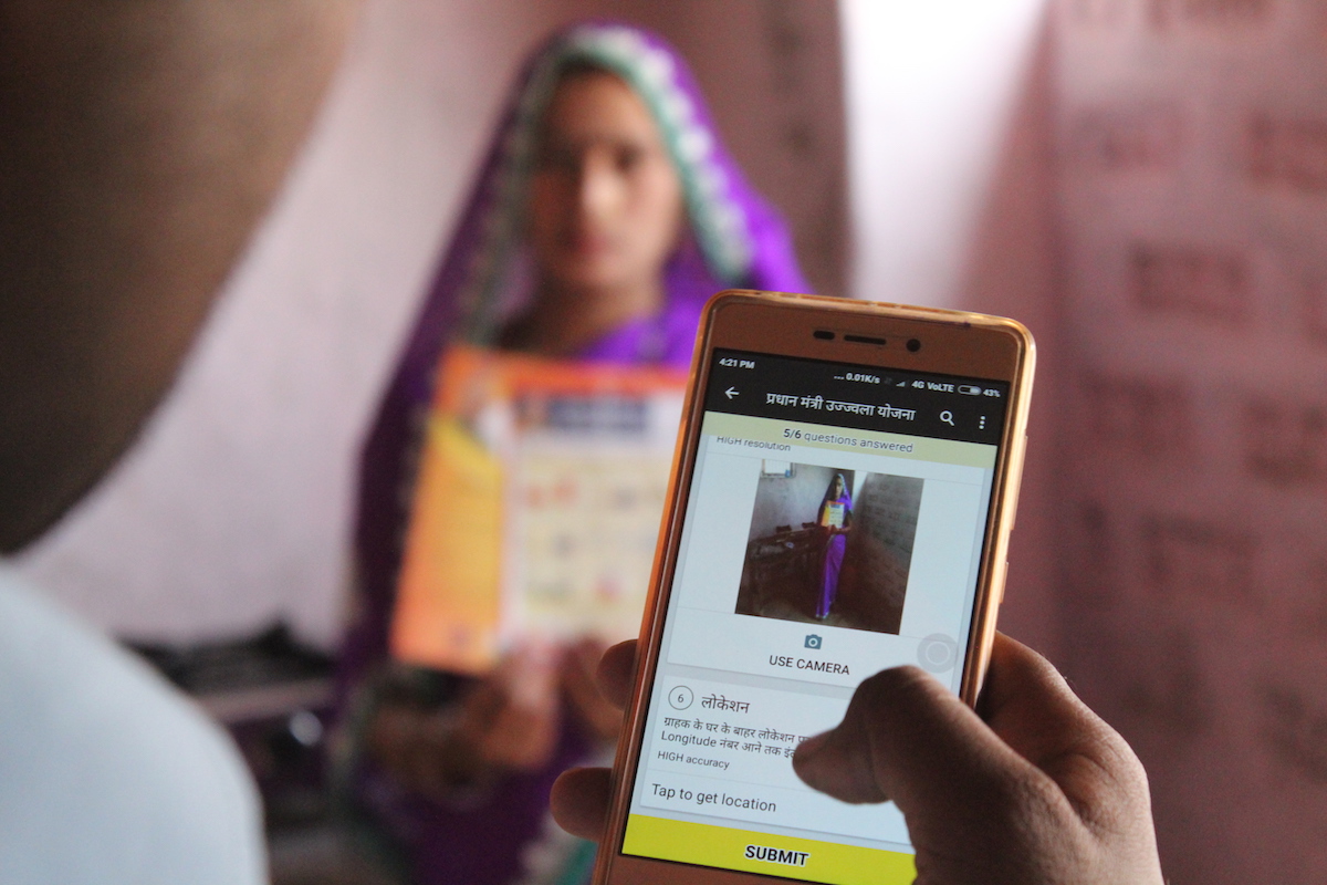
5. Consider battery consumption and data use
Mobile devices generally have more limited battery power and more prohibitive data usage than desktop computers. For mobile-friendly surveys, remove anything that will be challenging for battery life and data usage.
Pictures and videos in a mobile survey can be particularly problematic. Long surveys, even without pictures or video, can become a problem as well, simply because of the time spent using both device power and data.
As previously mentioned, brevity is best!
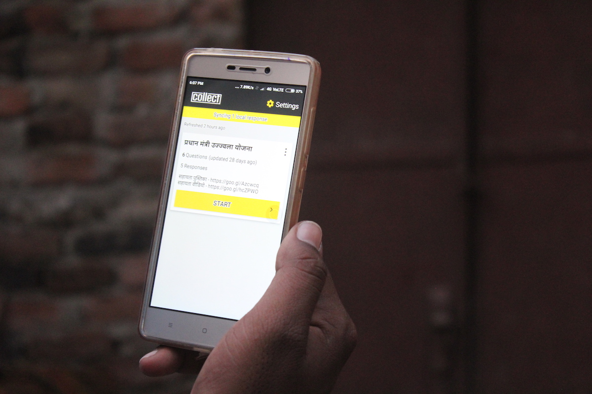
6. Use a mobile data collection app
To make sure your survey is adaptable and functional on mobile, use an app created specifically for mobile data collection rather than trying to open a browser-based survey on a mobile. Usually, browser-based surveys are not well optimized and the completion rate of a browser-based survey is usually drastically lower on mobile than on desktop.
There are quite a few apps out there that offer varying degrees of flexibility and customization, so it’s worth researching which would be the best for your specific survey.
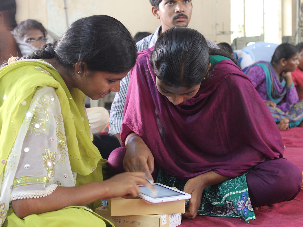
7. Test the survey on the mobile you’ll be using
Depending on how the survey was created and what tool you’ve chose, mobile adaptability could vary widely. It’s important to test surveys on the devices that will actually be used to ensure that the survey responds appropriately to a mobile screen. This will reduce frustration later on and increase the success rate for the survey.
To prevent data errors or survey complications, not all mobile devices should be treated equally. Consider and test all possible devices and operating systems that the survey may be taken on: cell phone vs. tablet, Android vs. iPhone, etc.
8. Consider why someone would be using a mobile device for the survey
This approach to optimizing a survey for mobile devices falls more in line with strategy than it does logistics, but it is still worth considering.
Why is this survey being carried out on a mobile? Is it asking about a particular experience or product that a user recently engaged with? If so, what are the most succinct and important questions to ask to make the time-sensitive survey most useful? Or is the survey just being doing on a mobile device because it is the most frequently accessed or most easily accessible?
Knowing the demographic information and needs of those taking mobile surveys can help influence your questions and make your data collection more useful.


2 Comments
Pingback: Data Science newsletter – July 14, 2017 | Sports.BradStenger.com
Pingback: How to a Build a Mobile Survey App? - DevTeam.Space